
Most traders build their process around a single lens. They watch price action, or they watch valuation, or they watch macro. The problem is that markets don't move because of any one factor in isolation — they move because trend, risk, valuation, sentiment, and macro conditions interact, often pulling in different directions at once. A model that only looks at one of these pillars will eventually get blindsided by the ones it ignores.
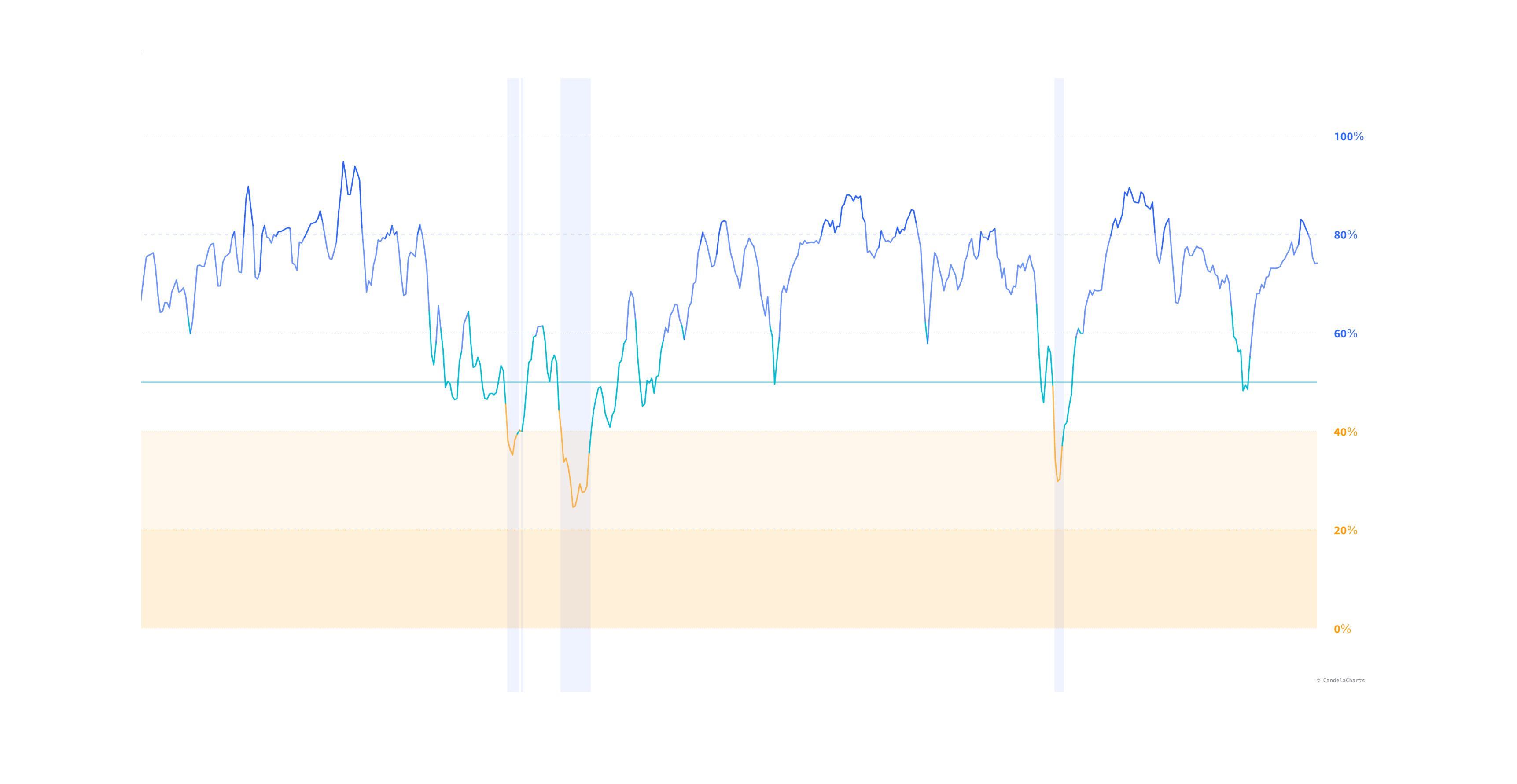
The CandelaCharts Quantitative Equity Model was built to close that gap. Instead of a single technical signal or a single fundamental ratio, it synthesizes five independent market pillars into one number: a recommended equity allocation between 0% and 100%. The goal is simple to state and hard to execute consistently — stay maximally invested during healthy bull markets to compound returns, and de-risk aggressively and early when the market shifts into a high-risk or crisis regime.
This article breaks down how the model is built, what each pillar measures, how the crisis engine and risk scaling work, and how to actually use the tool in a real allocation process.
The Core Idea: Allocation as a Single, Continuous Output
Rather than firing discrete buy/sell signals, the model outputs a continuous equity allocation percentage. That distinction matters. Binary signals force an all-or-nothing decision at an arbitrary threshold. A continuous allocation line lets you scale exposure gradually as conditions shift — trimming into strength, adding into fear — which is closer to how institutional allocation processes actually work.
The allocation line is built from five weighted pillars:
- Market Regime (35%): Trend strength, moving average structure, VIX regime, drawdown state
- Risk Metrics (25%): Volatility targeting, drawdown constraints, realized/localized volatility
- Valuation (20%): Forward P/E, earnings yield, margins, buybacks/dividends, ROE, FCF
- Sentiment (15%): Market breadth, volatility premium, sector rotation (risk-on vs. defensive)
- Macro (5%): Yield curve, credit spreads, safe-haven flows
Every one of these weights is fully adjustable, which we'll get to later — but the defaults reflect a specific philosophy: trend and risk dominate the allocation decision, while valuation acts as a moderating influence and macro/sentiment fine-tune the edges. This mirrors how most systematic multi-factor allocation models are actually weighted in practice — trend-following components tend to carry the most explanatory power for near-term positioning, while valuation is a slower-moving, longer-horizon input.
Pillar 1: Market Regime (35%)
This is the largest single input, and for good reason — regime classification is the backbone of the entire model. It uses a matrix of short and long-term moving averages (20, 50, and 200-period) combined with the current VIX regime and the market's drawdown from recent highs to classify the environment into a spectrum ranging from Strong Bull through to Crisis.
The logic here isn't just "price above the 200-day equals bullish." It's a composite read: are the shorter averages aligned above the longer ones (trend confirmation), is volatility behaving normally or is it elevated (regime stability), and how far has price already fallen from its highs (damage already done). A market can be technically "above the 200-day" and still be flashing regime deterioration if the VIX is spiking and drawdown is accelerating — the model is designed to catch that nuance rather than relying on a single moving average crossover.
Pillar 2: Risk Metrics (25%)
This pillar is where the model becomes genuinely quantitative rather than just chart-pattern-based. It implements volatility targeting — a technique widely used in institutional risk-parity and managed-volatility strategies, where exposure is scaled inversely to realized volatility. When volatility rises, exposure comes down mechanically, independent of whether price itself has moved yet.
To measure volatility, the model doesn't rely on simple close-to-close standard deviation. It uses:
- Parkinson volatility — estimated from the high-low range, which captures intraday volatility that close-only measures miss.
- Garman-Klass volatility — an extension that incorporates open, high, low, and close, giving a more efficient estimate of true price variance.
- Realized historical volatility — the traditional rolling-window measure, used as a baseline comparison.
Combining these localized, range-based estimators with realized volatility means the model can detect volatility expansion earlier than a lagging close-to-close calculation would — often the first real warning sign before a drawdown fully develops.
Pillar 3: Valuation (20%)
The valuation pillar connects to fundamental data to make sure the model isn't recommending maximum exposure at the exact moment the market is most expensive. It pulls in:
- Forward P/E
- Earnings yield
- Net margins
- Dividend and buyback yield
- Return on equity (ROE)
- Free cash flow
This is the pillar that acts as a check against pure momentum-chasing. A market can have a perfect trend and low volatility and still be historically stretched on valuation — this pillar tempers the allocation in those scenarios rather than letting trend and low-vol readings push the model to 100% indefinitely.
Pillar 4: Sentiment (15%)
Sentiment measures market breadth and risk appetite rather than price trend directly. It looks at:
- Breadth proxies like the Russell 2000 and NYSE Composite, to see whether strength is broad-based or concentrated in a handful of mega-cap names.
- Volatility premium, comparing implied vs. realized volatility as a gauge of hedging demand and fear.
- Sector rotation — specifically the relative performance of cyclical/growth sectors (like Technology) versus defensive sectors (like Utilities), which is one of the more reliable tells for institutional positioning shifts.
Breadth divergences — where a headline index like the S&P 500 keeps making highs while small-caps and the broader tape lag — are a classic late-cycle warning sign, and this pillar is specifically designed to catch that.
Pillar 5: Macro (5%)
The smallest weight, but not a throwaway input. This pillar tracks the broader macroeconomic backdrop:
- The U.S. Treasury yield curve (2-year vs. 10-year), a well-documented recession-risk indicator.
- High-yield credit spreads (HYG vs. LQD), which tend to widen meaningfully before equity drawdowns accelerate — credit markets often lead equity markets at turning points.
- Safe-haven flows into gold, the yen, and the U.S. dollar, which pick up during genuine risk-off episodes.
Because macro conditions shift slowly relative to price action, this pillar carries a lower weight by design — it's meant to nudge the model, not dominate it, except in genuine macro stress events where credit spreads or the yield curve move sharply.
The Crisis Engine: Overriding the Model When It Matters Most
Blended, weighted models have one structural weakness: in a genuine crash, a single pillar can spike into extreme territory while the blended average still looks moderate, delaying the response. The Automated Crisis Detection engine exists specifically to solve this.
It runs hard-coded thresholds independent of the five-pillar blend. If the VIX breaches extreme levels, drawdowns become severe, or high-yield credit spreads blow out, the crisis engine overrides the standard weighted allocation and forces an immediate move toward cash or safe havens — rather than waiting for the blended score to gradually drift down. This is the model's answer to the "slow-moving average in a fast-moving crash" problem that affects most blended systematic models.
These thresholds — VIX levels, max drawdown limits, and credit spread triggers — are all manually adjustable, so the crisis sensitivity can be tuned to match your own risk tolerance.
Portfolio Risk Scaling: Allocation Bound to Your Own Risk Limits
Beyond the five pillars, the model includes a risk-scaling layer that lets you define:
- Target Volatility (%) — the volatility level you want your blended portfolio (equity + cash/bonds) to run at.
- Maximum Portfolio Drawdown (%) — the worst drawdown you're willing to tolerate.
When enabled, the model mathematically adjusts the raw allocation percentage so the blended portfolio — not just the equity sleeve — stays within these self-defined risk boundaries. This turns the tool from a pure market-timing signal into something closer to a personal risk-budgeting framework: two users looking at the same market conditions can get different allocation outputs if they've set different volatility targets or drawdown tolerances.
Visual Buy Zones
One of the more distinctive visual features is the Buy Zone overlay. When the model's allocation drops into the 0-40% range — its own definition of maximum fear — the indicator marks this with persistent lower-bound chart fills and optional background highlights on the main chart, not just the indicator pane.
Quantitative Equity Model Buy Zones
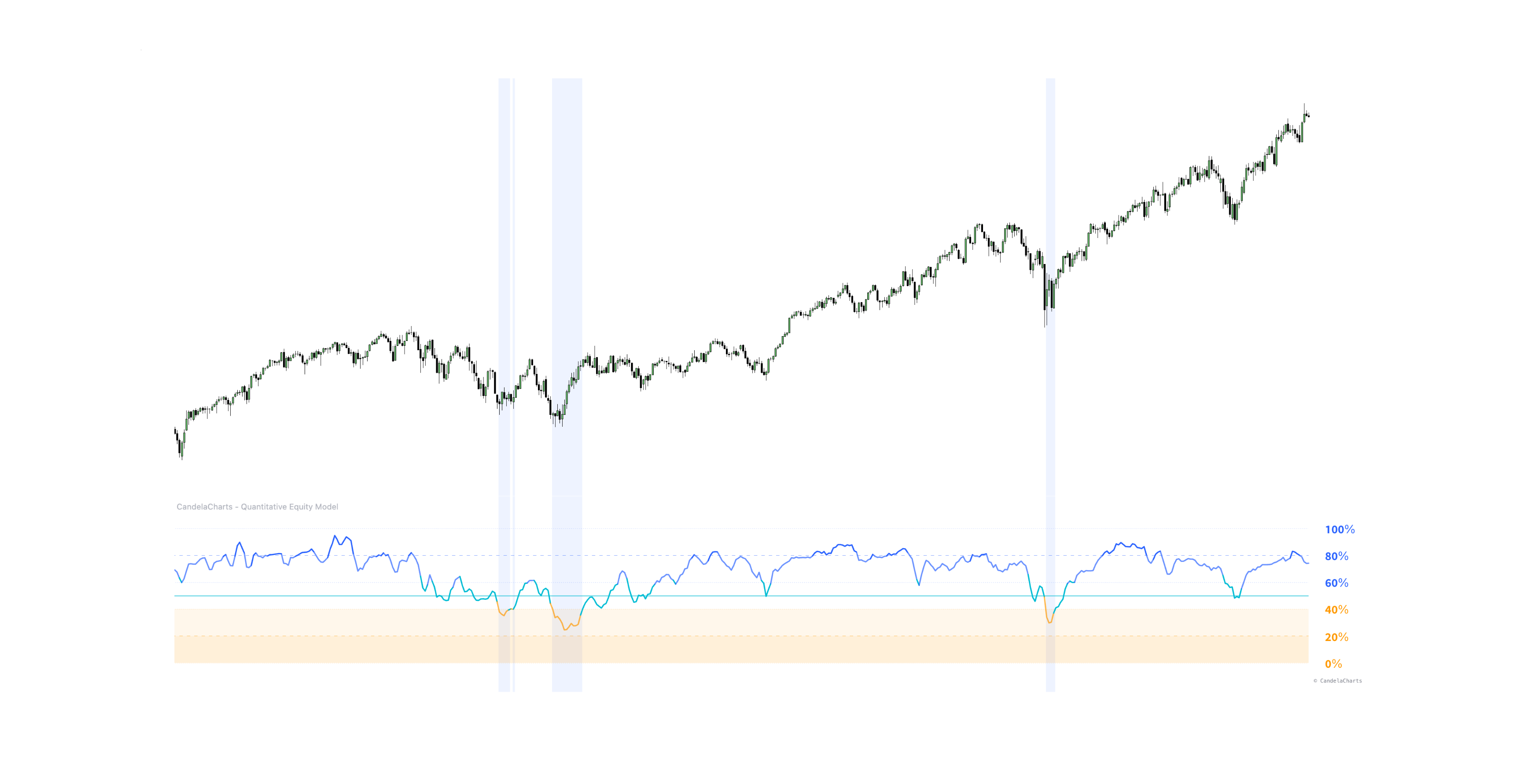
The idea is straightforward: the deepest, most uncomfortable allocation readings historically coincide with generational buying opportunities, precisely because that's when sentiment, valuation compression, and capitulation-level price action all align. Buy Zones make those windows visually obvious in hindsight and, more usefully, in real time.
The Dashboard: Seeing the Machine's Reasoning
A model that outputs a single number is only useful if you can see why it produced that number.
Quantitative Equity Model Dashboard
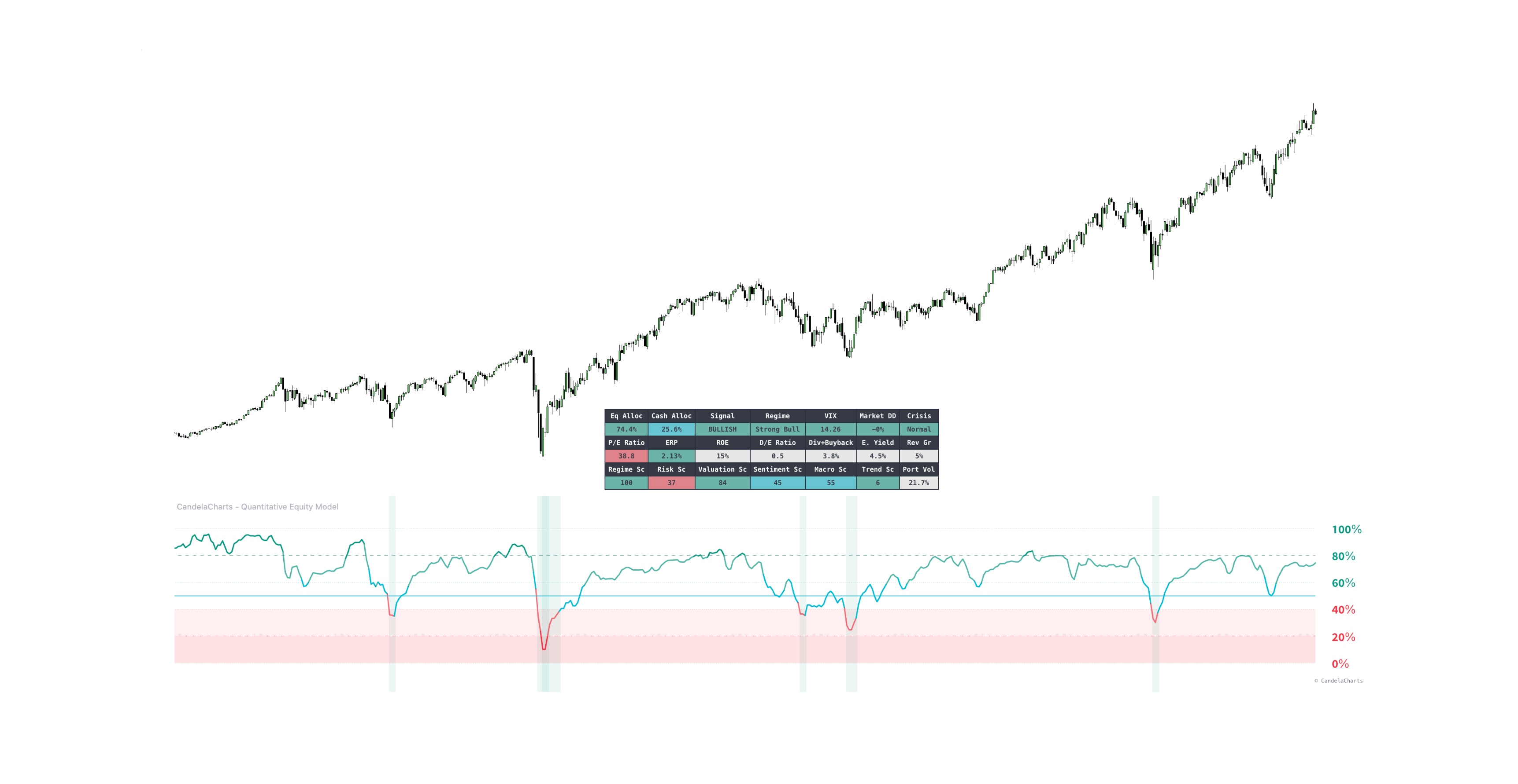
The on-chart dashboard breaks the black box open, showing:
- Overall Status — current allocation type and model state (Bullish, Bearish, or Crisis).
- Pillar Breakdown — individual scores and statuses for all five pillars, so you can see exactly which factor is driving the current reading (e.g., is the allocation low because of valuation, or because of a genuine trend/risk breakdown?).
- Risk Targets — your configured target volatility and max drawdown constraints.
- Crisis Monitors — real-time VIX, drawdown, and high-yield spread levels, so you can see how close the market is to triggering the crisis override.
This transparency is what separates a usable systematic tool from a mysterious "trust the line" indicator — you can always trace an allocation change back to the pillar (or crisis trigger) that caused it.
Settings: Tuning the Model to Your Philosophy
Allocation Type
The model ships with four presets that change how aggressively it reacts to changing conditions:
- Risk-Averse — quick to cut exposure, slow to re-enter. Prioritizes capital preservation over participation.
- Balanced — a steady, methodical response to changing conditions in both directions.
- Risk-Seeking — biased toward staying invested; slower to cut exposure even as conditions deteriorate.
- Adaptive — dynamically adjusts its own aggressiveness based on the prevailing Market Regime pillar reading, effectively behaving more risk-averse in weak regimes and more risk-seeking in strong ones.
Crisis Thresholds
Toggle "Use Crisis Conditions" on or off, and manually set the VIX level, maximum drawdown, and credit spread triggers that activate the override engine.
Customizable Weights
Every pillar weight — Market Regime, Risk, Valuation, Sentiment, Macro — can be adjusted (they must sum to 100%). A value investor might want to raise Valuation's weight; a pure trend-follower might push more weight into Market Regime and Risk while dropping Valuation toward zero.
Symbols
All underlying tickers used in the calculations can be swapped — replace the S&P 500 with a local index, or change the safe-haven proxies to match your own portfolio's actual hedges.
Appearance
Full control over colors, Buy Zone background visibility, and dashboard position/scale.
How to Actually Use the Model
The model is designed for top-down, medium-to-long-term asset allocation decisions — not intraday trading signals.
De-risking. When the allocation line drops sharply into the lower bounds (roughly 0-20%), multiple pillars are flagging stress simultaneously. This is the model's cue to meaningfully reduce equity exposure and rotate into cash or safe-haven bonds.
Re-allocating. When the allocation is pinned near 80-100%, valuation, macro, and sentiment conditions are broadly supportive of being fully invested.
Reading extremes as overbought/oversold. Because the allocation is bounded, it doubles as a sentiment gauge: extended readings near 100% suggest the market may be broadly overbought and vulnerable to a pullback, while readings near 0% suggest genuine panic and oversold conditions.
Spotting generational bottoms. The Buy Zone backgrounds exist for exactly this purpose — flagging the rare windows where the model reads near 0% during a confirmed crisis, historically the best long-term accumulation zones.
Where This Fits in a Broader Process
It's worth being direct about what this tool is and isn't. It does not generate built-in alert conditions, and it isn't a trade-execution signal for short-term entries. It's an allocation framework — a way to systematize a decision that most investors make emotionally: how much equity exposure to hold right now, given everything happening across trend, risk, valuation, sentiment, and macro at once.
Used well, it replaces a gut-feel "the market feels scary, I should sell" decision with a transparent, auditable, five-factor process you can see and adjust — and it forces the same discipline in the other direction, keeping you invested through healthy trends instead of exiting early on noise.
As with any systematic model, it should inform a broader investment process, not replace independent judgment — and results will always depend on how the weights, thresholds, and risk parameters are configured relative to your own objectives.